Presentation of the Beholder interface
- Getting started
GettingStarted
This chapter presents the interface of the Beholder and the main principles of navigation within the digital twin. It describes the different areas of the screen, the way in which the equipment is represented and the visual codes used to reflect their condition. The objective is to allow a quick and intuitive first handling of the application.
Overview of the interface
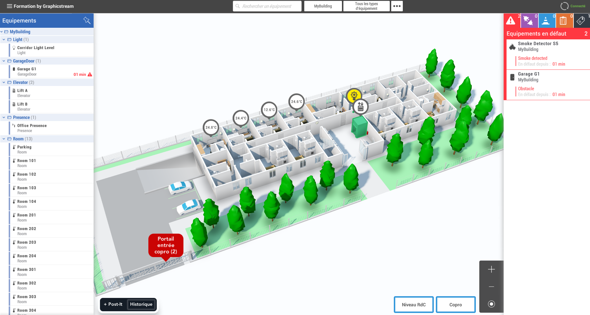
The interface of the Beholder can be cut into Four distinct parts :
- The Digital twin in the center of the screen.
- The Equipment List and selecting a piece of equipment on the left.
- A Alarm Summary in progress or workflow states on the right.
- The Menu bar at the top, allowing you to filter devices or access the global menu and connection status with the Hub.
The digital twin
The main view of the app is a representation 3D of the digital twin, on which are displayed the equipment associated with their performance. Equipment can be linked to a graphic object (such as a door model) and/or to an equipment bubble (3D Widget). The user can interact with these elements and click on them in order to select the relevant equipment.
Visual codes and equipment statuses
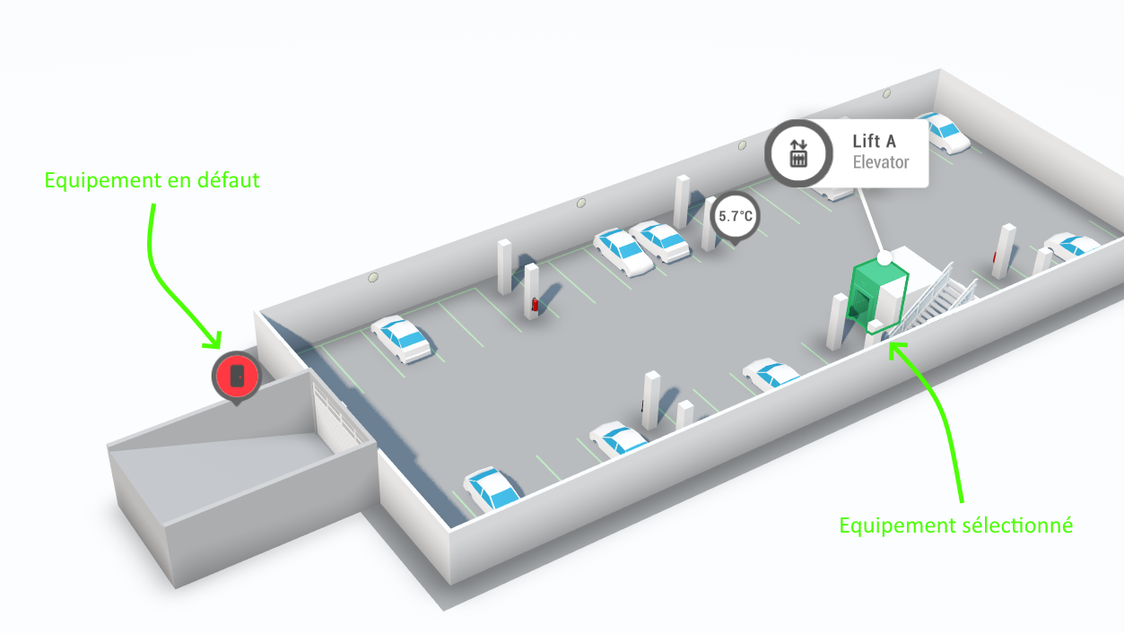
By default, any 3D object (excluding zones) associated with a piece of equipment is highlighted by a Colouring
which varies depending on the state of the latter (this behavior can be disabled by the scripting) :
| Color | Equipment Status |
|---|---|
| Green | Healthy equipment |
| Red | Equipment with a defect |
| Grey | Disconnected equipment |
| Blue | Equipment under construction |
| Brown | Equipment being diagnosed |
| Purple | Equipment losing connection |
Automatic coloring makes it possible to identify at a glance the overall condition of the equipment fleet.
This behavior can be disabled or overridden via the scripting.
Annotations in the Digital Twin
In addition, annotations (Post-its) can be added directly to the digital twin in order to add Additional information on the plan, not attached to a device.
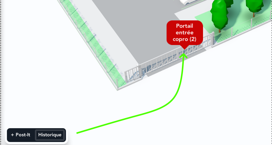
Annotations are useful for displaying visible directions, context, or temporary information by all users, without depending on any equipment.